A Successful Digital Signage Experience for Trade Shows
My Favorites From the New York International Auto Show 2022
I have been attending business trade shows since the mid-1990s when I first worked for a relatively small but very successful CD-ROM OEM hardware/software technology company. As time went on and I changed my technology focus (from data storage and backup to telecom/network, then video managed services, then AV integration and currently digital signage CAS), I was either an exhibitor or attendee at many technology shows and conferences.
When I was a teenager and even younger, I would go to the New York International Auto Show at the Jacob K. Javits Center with my father and some of his friends. The car manufacturers at that time showed off their latest designs and concept cars, in addition to those that were currently available. There was no digital signage as we think of it today — and online meant you were standing on a line in a store or outside the store if there was a giveaway.
Fast forward to 2022 — I just attended the most recent Auto Show (April 15-24) at the Javits Center, and the show and facility (recently increased 30% in size) have changed drastically, even from a few years ago. I mentioned in previous columns the criticality of providing an impactful environment for end users (professional or consumer). This trade show is no exception to that rule.
So, how do you create an immersive and lasting impression to affect as many of the senses as possible without being overwhelming? The Auto Show was a perfect example of this. Let me explain with a description of some of the parameters that were addressed specifically at this show which I would suggest for other trade shows as well:
- Aural — animal sounds, human speech, sound effects, music, etc.
- Visual — images, videos, media loops, procedural animation, streaming, text, etc.
- Non-Touch Interactive — using sensors to detect movement of entities or objects to trigger a change or activate a movement of content on a display or video wall.
- Touch Interactive — end users physically touch the resistive screen using a stylus or a finger for mechanical activation or projected capacitive touch screen using electromagnetic activation.
- Olfaction — sense of smell that detects and discriminates odors that can influence our natural responses.
Subaru
Walking through the event space, I passed by the extensive Subaru area. Designed to highlight the brand’s environmental efforts, long-standing partnership with the national parks and love of pets, the environment contained a larger-than-life Reveal Presentation Theater, several log-cabin-style structures, a rope bridge, real rocks and trees, national-parks-style signage, falling snow (made of bubbles), a pet adoption zone and an interactive digital “Cave of Wonder.” The immersive environment was designed and fabricated by EWI Worldwide (led by creative director Shane Wilson) and it involved a variety of engaging digital touch points.
I first walked into a small tunnel/cave that took me about 10 seconds to process what I was (1) looking at, (2) hearing and (3) smelling as I was watching people in front of me making gestures at a curved textured wall.
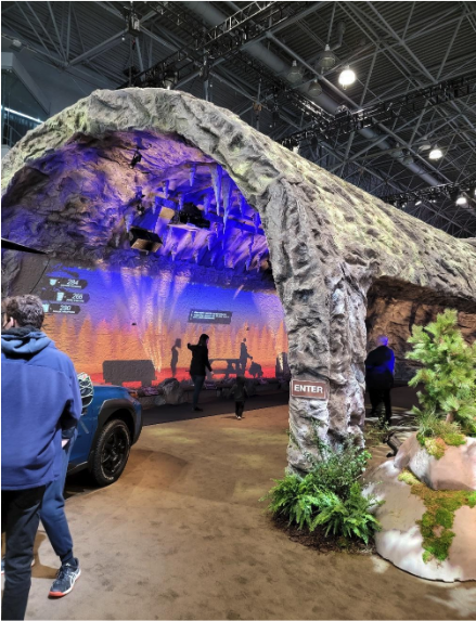
The cave at the Subaru exhibit at the New York International Auto Show 2022.
Jon Mulkey, brand manager at Subaru, showed my friend and me around the multiple environments the company’s design team from EWI Worldwide had set up over the previous week. This included the cave, the Reveal Presentation Theater, backstage technical studio, and “Outlook Tower” connected to a rope-bridge viewing area.
The Cave
This experience utilized cameras, short-throw projectors, special software, lighting, speakers, live vegetation, and scents pumped out of a hidden device on the floor. The three scents that made up the “cave smell” were: spinach, wet grass and butcher shop — created by Froggy’s Fog. (I was in a cave and an inactive volcano in Iceland in September 2019 and I had to agree, they got it right.)
As they set up the environment, the design team had to adjust many of the components to make sure the proper effects were achieved. Some of the devices needed additional pieces of the textured wall built around them (cameras) and/or as platforms (projectors) as camouflage so they appeared to be part of the set. Jon introduced us to Al Haibach from Custom AV Solutions (working with the EWI Worldwide Design Team) who showed us even more details on the cave project, such as hidden tech devices (see below) within the rocks on the floor behind the exhibit, who knew?
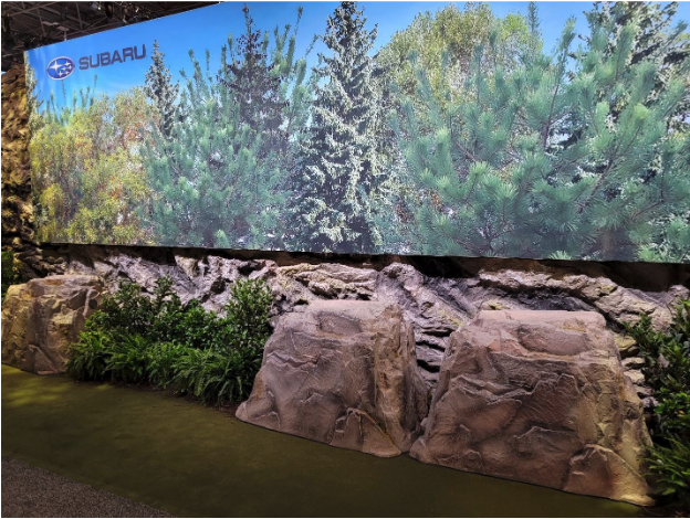
Check out the rocks in front — they hide the tech powering the Subaru exhibit.
The Reveal Presentation Theater
This set included many components: An automated cyclorama LED Screen that split into two separate walls, a background video wall to match the foreground content, a very large (stage) LED floor all framed by curved carpet, rocks and plant life and an overhead graphic banner (ribbon) for an additional effect.
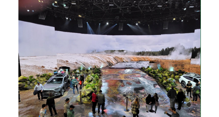
The Reveal Presentation Theater.
Mike Hansen, creative producer for Hansen Productions, told me the whole idea was to create an immersive and unexpected experience for visitors in the auto show environment. This space includes a full-surround soundscape integrated with environmental special effects, further enhanced with the addition of smell and touch. The visual media designs are custom mapped onto the LED, which covers the floor and main stage with an integrated turntable, wrapping high-resolution scenery from America’s national parks around the visitor wherever they are in the theater. This created a one-of-a-kind experience within the Subaru display. Hansen Productions provided production creative, design and management for the Reveal Presentation Theater, with fabrication by team partner EWI Worldwide.
Every hour, the production team staged a live reveal of the Subaru Solterra, with expansive soundtrack and impressive visuals, culminating with the dramatic bi-parting of the panorama screen and the Solterra emerging in front of the signage.
More Signage
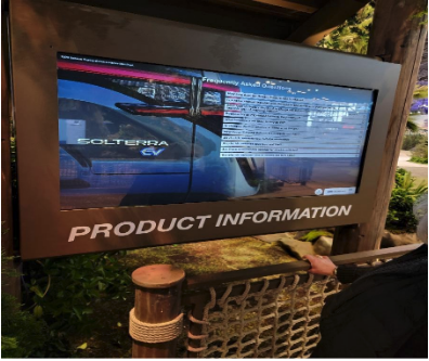
As I walked through the front “exit” of this environment, there were two displays on either side, on the left was the Subaru Product information:
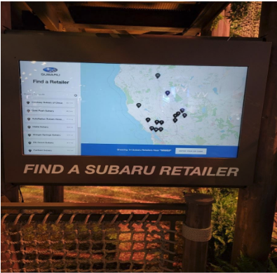
The right side had the Subaru wayfinding dealership locations:
Backstage
Subaru managed this hourly event with only a few people, including the stunt driver. The “wall” behind and above the computer monitors is actually the back of the background video wall that can only be seen during the “reveal” (see video above and look very carefully).

Subaru’s control room for its exhibit at the auto show.
Kia Motors
Al took us to another signage project he helped to set up with EWI Worldwide for Kia Motors, at the other end of the show floor. We walked to a stand-alone display and a small digital signage exhibit — a whole new level of end user experience. Al pointed out that this client wanted the design team to create a smaller, almost individual exhibit for each consumer to experience:

I walked up to the waist-high panel in front of a large display, read the instructions and then placed my hand exactly 12 inches away from the middle of the panel. I immediately felt the pulse of the ultrasonic sensor hit the middle of my palm which triggered my “hand” appearing on the display in front of me (about 8 feet away). Al mentioned that during testing, the design team had to create a visual instruction plan on either side of the panel so attendees would know just how make the interactive device work properly.
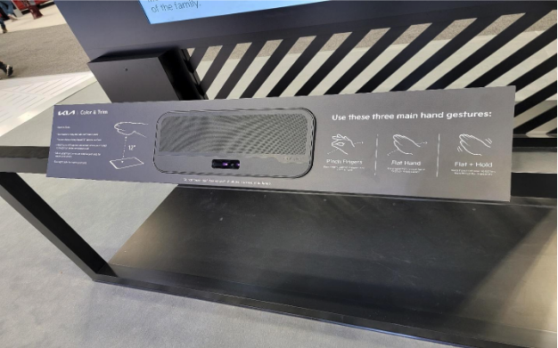
The instruction panel for the interactive experience at the Kia Motors exhibit at the auto show.
I was then able to manipulate the images on the screen via hand gesture:

In terms of attention to detail, the design team created text and added lights to brighten the graphics on the back of the display. They added black felt around the lettering so the graphics would pop and could be seen from much further away — and perhaps making it easier to read for those who are nearsighted.
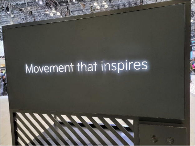
In that vein, I’ll leave you with my final thought: I would like to see signage more focused on being accessible for all — which is very important as well. Perhaps this will be even more of a focus at future trade shows.
Here is the latest set of terms and definitions to help you navigate this column.


