
Content Scoring Framework for Digital Signage
By Lyle Bunn
Strategy Architect, BUNN Co.
Digital signage hangs on one single word — “benefit” and it is content, the media presented on digital signage that delivers this benefit once the technology infrastructure is in place. The quality of content and the merit of investing in this has been an ongoing frustration for network operators. Perhaps this is in part because impact analysis is not commonly conducted and no easier mechanism exists for assessing content quality. What follows is a framework for evaluating content quality toward improving specific and overall benefits through improved content.
The ability to display motion, animation in content that is suited to the audience, time of day and location of presentation make the medium inherently powerful. Too often the fuller advantages that can be gained from the medium are not realized as basic messaging is considered adequate to achieve suitable viewer impact.
Content can achieve four areas of impact simultaneously as illustrated in the graphic below.
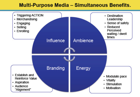
- Influence reflects the tangible outcomes of value such as product or service purchaseor enquiry, registration for events or programs, visits to websites of mobile engagement that is triggered.
- Branding outcomes are measured through brand awareness or propensity for future purchase and product/service reference.
- Ambience is measured in terms of the degree to which the content reflects for add to the environment in which the display is located. The reduction in perceived wait time is a further indicator.
- Energy reflects on the level of vitality, excitement or calm resulting from presentation of the content at that location.
- Content impacts on audiences in each of these four ways and may affect different viewer demographics differently, so distinguishing the target viewer demographic is a key element of content composition planning.
This four-benefit framework provides an easy way to assess the quality of content.
Weighting can be assigned to each of these four areas of intended outcome. For example, an area of high importance, such as influence, might be assigned a score of 40 possible points, while an ares of lesser importance such as energy might be assigned a score of just 10 possible points wht branding and ambiance at 20 points each.
Then, score each of these four areas subjectively upon viewing the content, or more objectively based on impact data or viewer survey results. Strengths and shortcomings will become clearer, and a usable language with which to communitcate areas of improvement is available.
Some questions which might be asked during content scoring include:
- Is what is being communicated consistent with intended outcomes?
- Are the font size, style, color contrast to background and the pace of appearance or animation suitable for viewers to easliy consume or ingest the text?
- Is there too much text for the viewer to read in the expected timeframe, in particular when they are in the process of making a decision based on the information presented (i.e. menu of product or service options)?
- Are graphics and images appealing, eye-catching and a positive reinforcement of the value proposition?
- Does the color palette used for the content reflect the brand accurately?
- Are images of products the best that they can be to reflect the product the consumer will receive?
- Are the text and images related to and aligned with each other?
- Is there a specific or clearly implied call to action?
- If there are multiple options for product/service selection, is the recommended option emphasized?
- Are there graphics or icons in use that may not be easily understood or interpreted by the viewer?
- Does each message appear for a suitable duration?
Answering these questions to score the content in each of the four areas identifies where areas of improvement are required. It also offers an overall score for the individual spot.
For example, if influence achieves a score of 20 out of 40, branding gets a 10 out of a possible 20, ambience gets 10 out of 20 and energy gets 5 out of 10. The total score for the spot is 45 out of 90 or 50 percent.
The level of an acceptable score can be established in conversation with the network operator, location provider, the message owner and content producer with whom acceptable or target levels can also be established. Content spots that do not achieve a high score are very good candidates for improvement.
It also makes sense to score the overall play loop while assessing individual content spots. A similar scoring structure around criteria such as play loop versus typical viewer dwell time, transitions, compliance with an overall style guide and suitablity of a multi-zone layout.
Some questions to ask during this scoring include:
- How does the overall length of the play loop correlate to typical viewer dwell time? This should be a one to one ratio so the viewer can see all messages in the loop. Messages that are not seen cannot be expected to produce outcome and most viewers would find it acceptable to see messages two or perhaps three times.
- Are transitions between individual content spots smooth and appealing to the eye, while maximizing message presentation time?
- Do all of the content spots generally use the same color palette or is the viewer challenged to accept and interpret a range of composition styles and color choices?
- Does the use of multiple zones on the display layout support or hamper the achievement of desired benefits?
Scoring of the overall playlist will provide indicators where adjustments could achieve greater benefits in this area.
This column was reprinted with permission from the Digital Screenmedia Association and originally appeared here.


More Stories Like This
AV 101: Digital Signage for the Industry Newbie

In the fall of 2020, as I waited in the single line at my California grocery store (making sure to keep the federally recommended 6 feet of distance), a display on a makeshift stand showed a single number indicating which checker was available to help me. The line was long. As I waited, I had […]
Going From ‘Wow’ to ‘Whoa’

Working in the experiential space, I hear one phrase all the time: “Wow” factor. Companies are looking for ways to create a wow factor to differentiate themselves from the competition and to get the attention of new talent and new customers. Wow factor is an important first step. In a world clamoring for your attention, […]
Why AV Integrators Absolutely Need to Be Thinking About Content Creation

THIS IS A PROMOTED POST FROM MVIX By Lillyan Wamaitha Marketing Manager, Mvix In the past, clients would come to integrators knowing precisely what they wanted. They’d ask for specific monitor “A,” speaker “B” and microphone “C.” They knew what their creation was to be; they only needed an AV integrator for the hardware. Today, things […]