Grab Your Digital Crayons
The focus of this series “Power of Content” is to help people with content strategies and how they relate to digital screen media.
With a bleak grey winter across the northern hemisphere, I thought it’s time to talk about color. The basics of color can summed up by saying that there is a rainbow out there — so use it. BUT… use your rainbow sensibly. Some color combinations are pleasant to view; others are jarring, even ugly, while still others send messages based on our common cultural background (red and green mean Christmas in the U.S.; red, white and blue imply patriotism). And some combinations simply make it too difficult to present text in a readable and comprehensive way.
First, let’s look at the typical color wheel that is most familiar when choosing colors while working in PowerPoint or Word (Figure 1). If one looks closely at the color wheel, one notices the outer edge of the color wheel displays the darker colors while the center shows the lighter colors. This is based on the 32-bit color standards of RGB (red, green and blue), where values of zero for each creates black, while R, 255 G, 255 and B,255 is white. A value of R,255 G,0 and B,0 is pure red, and so on. Setting different values for R, G and B within this range of 0-256 gives several million possible color choices, although a very slight change in a single value rarely produces a color that the human eye can distinguish from the original.

Figure 1: Common type of RGB Color Wheel Chooser ©2014 Keith Kelsen
When selecting colors from the wheel one can use the combination of inner wheel colors and outer wheel colors to set a contrast to any presentation using text. Figure 2 shows how choosing contrasting values — such as white on black and grey on black — directly affect how well the content will be comprehended and the speed at which one can comprehend the message.

Figure 2: Using white on black and rather than grey on black creates more contrast and makes it easier for the viewer to read. ©2014 Keith Kelsen
Similar thinking can be applied to color in practical ways while choosing contrasting colors that work. First and foremost, choosing a dark color for the background and a light color for the foreground or vice versa will have a direct impact on the ease of comprehension (Figure 3).

Figure 3: Use contrast when choosing text against backgrounds ©2014 Keith Kelsen
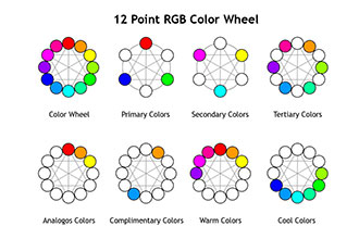
Which colors work best with other colors? Take a look at the basic color wheel (Figure 1), you will notice that in its original design there are twelve colors that make up the wheel. The first circular color diagram was designed by Sir Isaac Newton in 1666. The color wheel is designed so that virtually any colors you pick from it will look good together. While important aspects of the color wheel and color theory are well known to artists, they might not be fully appreciated by someone that has a technical background. Although the wheel is made of twelve shades of colors, there are basic primary colors that are made of red, green and blue (Figure 4). This is different from the primary colors we learned at a very young age, which are red, blue and yellow. These new primary colors are based on the medium that we are working in — projected light rather than reflected light.

Figure 4: Building Blocks of the RGB Color Wheel ©2014 Keith Kelsen
The colors adjacent to the primary colors) are the three secondary colors of cyan, magenta and yellow. The final six intermediates are formed by mixing a primary with a secondary are known as tertiary colors, for a total of 12 main divisions.
Analogous colors are directly next to a given color. If you start with blue and you want its two analogous colors, you select purple and red. A color scheme that uses analogous colors usually matches well and creates natural and comfortable designs. When choosing an analogous color scheme, however, it is important to make sure you have enough contrast. Choose one color to dominate, a second to support. The third color is used (along with black, white or gray) as an accent.
Complementary colors are opposite each other on the color wheel (for example, red and green). The high contrast of complementary colors creates a vibrant look that is undesirable for digital signage, especially when used at full saturation. Complementary colors are best used as accents or when you something to stand out, but is particularly inappropriate for text (Figure 5).
Warm colors and cool colors are on the opposite side of the color wheel (Figure 4). One can use this basic warm or cool scheme as a guiding palette.
As with any media there are colors that work together well and combination of colors that collide. When choosing colors that work well together, one can reference the color wheel and remember to look at the contrasts (light over dark) even within the same color. For the RGB scheme of colors, yellow and blue work, as well as red and yellow. Just the opposite is true on colors that fight each other or vibrate on the screen (Figure 5). Color combinations to avoid are typically the tertiary complimentary colors.

Figure 5: Tertiary complementary colors combinations are difficult to read. ©2014 Keith Kelsen
Applying these best practices will get you great results. Working with brands and company colors, one can use the color wheel to create tasteful backgrounds and other graphics that will work well with the company’s color scheme. Remember however each display is different from one manufacturer to another. Colors will vary out in the real world from display to display, so corporate colors will never be a perfect match.
In creating any message, choosing the right color combination can make or break the comprehension of the message.
Author and speaker Keith Kelsen, chief visionary at 5th Screen, is considered one of the leading experts on digital media. More information about his book, Unleashing the Power of Digital Signage — Content Strategies for the 5th Screen, published by Focal Press, can be found on the book’s companion website. Reach him at keith.kelsen@5thscreen.com or on Twitter.


