
Aesthetics, Part the First — Minimalism and the Tyranny of the Black Rectangle
 The past centuries have spanned many technological eras, each with a dominant aesthetic as well as dominant technologies.
The Victorian era was the age of steam, of the first attempts to harness electricity. It was also an era of brass, polished wood, colored glass. It was an era in which a technical marvel was also expected to be a thing of beauty. Modern “steampunk” culture — a literary and stylistic movement — strives to recapture this today.
Technology and culture marched on, from the clean art-deco lines of the diesel age to the exploration of plastics in the early atomic age. One thing is certain — each age had a look. A television or phonograph from 1950 was clearly different in look and style from one in 1980, but each had a look that fit its generation and culture.
Until today.
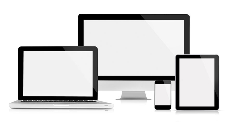
At some point, perhaps with the first iPod, we collectively fell in love with minimalism as a design choice for technology. Soon thereafter, we chose the featureless black rectangle as the ideal shapes. I own no fewer than seven featureless black rectangles in varying sizes — three LCD TVs, two computer monitors, a tablet and a phone.
Why does this matter?
For some products it not only doesn’t matter, it can be an advantage. The Shure MXA910 microphone is designed to invisibly fit into a standard 2×2 ceiling grid; this saves some of the conflict between the AV and interior design disciplines. When the Clear One was the only available digital array microphone there’d often be a debate between aesthetics and audio reproduction and whichever solution was chosen would be a compromise. The Beamformer does have a more distinctive look than the MX910, but in this case a distinctive look is not what most of us want in a microphone.
A video display, however, fills a different niche than a microphone, often serving as a visual focal point, be it in a boardroom or a living room. There is a growing part of me that wonders: Why do we want our visual focal points to be featureless black rectangles?
I was thinking about how easily this could be improved while running on the elliptical machine at the gym one morning. Here’s my view:
As you can see, the gym has a design aesthetic, one rooted in the later part of last century. They also have a color scheme — everything is red and yellow — the weight machines, the accent walls, even the staircase to the mezzanine is red-painted steel. The signs reminding you to wipe down your machine are red and yellow.
The TVs — including the one mounted right in front of your face — are black.
Imagine how much more unified a look they’d achieve if they were only featureless red rectangles, or yellow rectangles. The treadmills, stationary bikes and ellipticals even have yellow-painted VESA mounts for black flat panels. For manufacturers of flat panels, are options for differently colored bezels really that difficult a thing to offer?
Why are we so in love with black and so afraid of embellishment?
Imagine how much more unified it would look without the red and yellow being broken up by dull black.
As an AV professional, imagine not having to debate aesthetics.
Uniformity of theme is one reason I long for a splash of color, but ornamentation can be more — It can be a way for a piece of tech to become something special, something which creates an emotional connection. Something more than a mere tool. Read this passage from Cathrynne Valente’s The Boy Who Lost Fairyland:
“The gramophone unfolded four long, curved brass legs from its wooden table. Each one of them ended in a curly lion’s paw like Thomas’s bathtub. It had been beautiful once. Bold green and blue filigree patterns still gleamed on its bell, though the paint peeled and cracked. The gramophone tottered up and backward like a baby bird…”
So yes, this was an ordinary gramophone a fairy had brought to life and was keeping as a sort of pet. What occurred to me as I read this passage is that we have relatively few things — especially in the tech world — which are lovely enough to become cherished and special items, that we could imagine as a pet or a plaything. Minimalism does have its place and might fit in some places and some situations, but must minimalism be the ONLY design choice? Can we break free of the black rectangle?
There are signs of hope. At this year’s CES, Sony introduced a short-through projector with an Italian Marble surface and shiny chrome legs, clearly meant to serve as a handsome piece of furniture as well as an admittedly high-priced bit of technology. Is it the best choice for a lobby display? Perhaps not. What does make it interesting is that the way the object looks and the way it fits into a space were clearly considerations. It’s not merely a display, it’s a handsome piece of furniture which, on its own, makes a statement.
Samsung offers three colors for “picture frame TV” — walnut, blond wood, and white. While three colors of one frame style are hardly a dizzying array of choices, it is a step towards having more options, to breaking free of the tyranny of the featureless black rectangle.


More Stories Like This
It Just Needs to Work: An Exploration of User Experience

I talk a lot about our industry and the shifting center of the technology design process toward human-centered design and the holistic user experience. When talking about large, complex systems, most of the AV people I speak to agree that experience is key. Still, when bringing this idea down into the design of something like […]
How AI will Truncate Timelines and Produce Better Outcomes

I had the pleasure of supporting an LA-based event this month and discussing how AI-based workflows will affect office designs as we move into the future. Most talk of AI in the AV industry has to do with sensor based automation, like personalization and camera tracking and switching in meeting rooms. Most of the buzz […]
PPDS Philips Sells Half-a-Million Hotel TVs Already

PPDS (aka: Philips Professional Displays) says it just sold its 500,000th Philips MediaSuite TV to a leading hotel group. With Chromecast built-in and Netflix-ready entertainment solution reached the half-a-million milestone during ISE 2024 in Barcelona this month, less than five years since the series was first introduced. Said to have exceeded PPDS’ own internal targets, […]