
What Makes For A Good Interface Design?
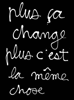 Not long ago I was chatting with my friend Aaron Craig, owner of NT Designs, a freelance automation programming company. One of the themes in our discussion was that “plus ça change, plus c’est la même chose” (the more things change, the more they stay the same).
The touchscreens that programmers are creating GUIs for have changed (mostly to iPads — at least it often seems that way), and the resolution of the graphic image files used for buttons and widgets is greater, but at their heart, user interfaces follow the same best practice rules that they have since the days of monochrome LCD screens.
The most critical to creating client satisfaction is to maintain uniform standards for system interfaces. And interfaces need to not only be standard, but also sensible.
Buttons and functions in the control system have to be obvious and clear. When I was still doing design, my guiding philosophy was cribbed from an architect who said: “If a thousand people a day pull on a door marked ‘push,’ it doesn’t mean that people are stupid — it means it’s a badly designed door.”
So what makes an interface actually work for the end user?
Smart programmers design for their user. AV pros are all in love with technology, but can forget that their clients aren’t. Take a cue from Apple and ask yourself, “Can a toddler or a senior citizen operate this?”
Face it, your clients’ retention of information during your system walk-through orientation meeting is nearly zero, and their babysitter won’t be there for you to explain it to her either. Better in the long run to design an interface that doesn’t require a manual to operate.
Everything should be consistently placed and labelled. Every interface, whether it’s a keypad, touch panel or a “TV On Screen Display” should follow the same consistent layout. If multiple rooms each have a handheld remote control, the button layout should be identical, or at least very similar.
Again, taking a page from Apple, program a “Home” button on every page, so if users get lost in the menu they can go back to where they began.
Provide control feedback, within reason: Without acknowledgement that a command has been entered, people will keep mashing the same button over and over again. In truth, even with feedback, some people will do that anyway! Regardless, whether a touch panel button changes color when pressed, or a hard button makes a beep or click, or a status bar loads to indicate that the system is thinking, feedback will keep clients patient.
Lastly, keep it simple. You can’t make clients do more with their system than they want to. If the client just wants to listen to music and watch TV, putting functions in front of them that exceed their desires is just going to confuse them. Like an iceberg, 90 panel of a control system’s capabilities should be hidden away from the client. Unlike an iceberg, it’s for good reason.
When I was being trained, the mantra “Proper Processes Provide Repeatable Results” was drilled into my head. Do things for clients the same way every time — logically and simply — and you’ve gone a long way towards keeping your clients unconfused and happy.


More Stories Like This
Extron Ships New Ultra-Wide TLP Pro Touch Panel
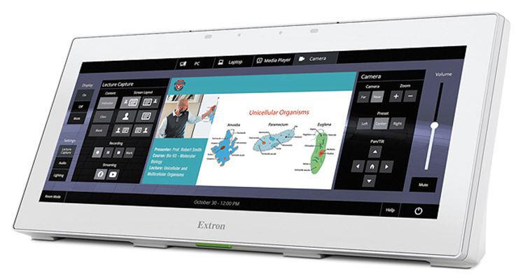
Extron is shipping its ultra-wide touchpanel, the TLP Pro 1230WTG. Featuring a 12” 1920×720 resolution touchscreen, the ultra-wide format enhances user experiences since it allows multiple tasks to be seen and managed at the same time. The TLP Pro 1230WTG provides screen space to simultaneously display full AV system controls, video preview and annotation controls. […]
Elo 5553L 4K Interactive Display Announced
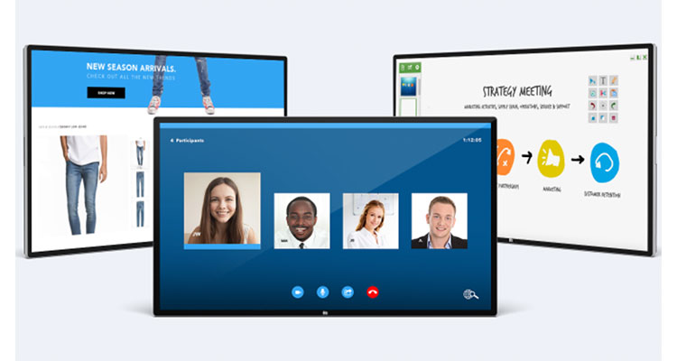
Elo announced the launch of the Elo 5553L 4K touch screen, a 55-inch interactive display and the latest addition to its 4K line. With a new design built for 24/7/365 use, the Elo 5553L is designed for interactive applications, including digital signage, self-service, corporate collaboration, whiteboarding and huddle rooms. Both the 65-inch display introduced in […]
Extron Adds 5″ Cable Cubby Touch Panel to UCC Line
Extron has announced the addition of the TLP Pro 525C, a five-inch Cable Cubby Series/2 TouchLink Pro touch panel with a flip-up touchscreen built into an all metal cable access enclosure. They designed this latest TouchLink Pro touch panel with a quad-core processor, more memory and a 800×480 capacitive touchscreen built with scratch and smudge-resistant […]