Digital Signage Content Design — Work With Your Medium
I fly through Buffalo’s airport quite a bit because airfares are usually way cheaper than Toronto once all the taxes are slapped on. And BUF is a nice, manageable size to get in and out of.
Every time I am in that terminal, I see this big set of tiled screens put in place by a local DOOH operator, and every time I shake my head at the rough job the company does with content. The problem is not so much the creative skills. It’s the utter refusal to acknowledge the bezel seams and the havoc they play with the presentation.
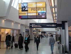 With just about every ad and content piece, these thick, ugly bezels intersect images and statements – the net effect being content that just doesn’t work.
The crazy thing is that while those bezels are not going away, it’s entirely possible to work with them instead of surrendering to them and putting out a crap program. I know a guy who designs content for some of the big, crazy-shaped LED boards in Times Square, and he has a template right in his authoring tools that shows the real shapes. So he works with them.
In this far simpler case (and I write this because I’ve seen the same thing elsewhere), the answer is a template or mask that shows where the grid lines will be on the display. Content design doesn’t have to do anything more than acknowledge how the screen is broken up, and nest the images and design the statements so they aren’t bisected.
Seems pretty obvious, but so much creative work is done on a regular monitor that’s two feet from the designer’s face. With this stuff, there absolutely has to be a nod to where the spots will play. It starts with the obvious, like gridlines, but extends to font size and color/contrast. Fundamentally, the motion graphic designer needs to see and understand what the finished product runs on, and work with those limitations.